Wednesday, 28 September 2011

Extra Photo Research

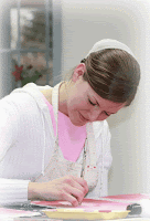
sAs said at the end of my last post, I want to focus my extra photo research on the magazine with the artist on the front cover, I have decided to create a magazine front cover for an artistic school. To get some ideas, I searched the internet for photos such as this.

In this photograph, you can see that the colours are quite dim and light coloured. This would mean that there is room for a bold, bright title which is one plan I could use for my magazine. The girl is this phototgraph looks too posed and it is clear that she is working for the camera. In my photo, I want to create more of a natural, real photograph.  


Looking at further pictures, this photograph is a further development of what I want. Instead of having the whole body in the middle like the previous photograph, I want the body to be on the right hand side like the photo here. However, instead of drawing on the board like this, I will sit my model on a desk in order to make it look more educational.
This would mean I am taking an idea from both photos I found. On the previous photo, the girl looks rather posed whereas here, it is clear this girl is concentrating more on her work instead of focusing on the camera. In my photograph, I want to do a mixture of both of these techniques. I want my model to look like they are having fun but concentrating at the same time.

Research On School Magazine Front Covers

The first bit of work that I am going to publish is the research I have done on school magazine front covers. By looking at different magazines covers and drawings, it allows me to gather up an idea of what I want to be in mine. Throughout the next posts, I will show my development on the front cover and how i discovered which ideas i want to use for my own.  

 1. My first magazine represents Greenfields School. I chose this magazine cover because it stands out by making the school look happy and friendly. I think using this technique is likely to draw students in as it comes across as a place that you could settle in easily which is what every student looks for in a school. The three children show that this school is for young students at a primary age. However, in the bottom left hand corner there is a photo of older students with medals. This illustrates that the school also provides facilities for older students. All the photos on the magazine have a strong impact on the reader as it implies a lot is going on. The colour scheme used is very effective for this type of magazine. All colours are bright which creates the warm, settling view that was mentioned before.


2.  This is my second magazine and It is clear from this magazine cover, that Tallulah Falls is an artistic school. The dark colour of green stands out in as it gives the magazine sense of professionalism and warmth. In the background of the photo, there is a girl painting. The photograph is very effective as it shows what the schools about. As well as looking like quite hard work, the work looks enjoyable and appealing which will attract students to the school. Another feature of the magazine is that there is minimum text. This means that there is not a lot to read and makes the viewer more eager to look inside. This is the type of magazine I will be looking further into and basing my photograph research on.

Starting up!

Hello! I'm Jessie Plant and i am doing AS Level Media at Wilmington Grammar School for Girls. I am using the blog to display all my work throughout the year. This will include my step by step development towards my final piece. Here, is where you wil be able to see all my process so enjoy!