In what ways does your media product use, develop or challenge the forms and conventions of real media?
At the beginning of the project, we did research on various school magazine covers and contents pages. This research meant that i was able to use real media in my work as i got ideas and developed them from it. I found many different ideas and examples on the Internet which in turn, helped me to finalise my decision of basing my magazine around art.
The front cover of my magazine includes a large, bold heading and subtitles written in red font. Here, i use conventions and forms of real media as i got all my ideas from real life magazines. Red is known as a bold colour and is regularly used in magazines to make story lines stand out. Although some parts of my colour scheme go well, i think i could next time improve and need to think carefully about which colours go well together.
How does your media product represent particular social groups?
From looking into my research, i decided that i wanted to base my magazine around art and different artists. Having this idea in mind meant that i could base my photographs and contents page around art. My main aim was to attract art students to the school i am representing. I believe i successfully did this as my title and photograph were based around art.
What kind of media institution might distribute your media product and why?
The kind of media institution that i would distribute my media product would be in a school and independent institution. I want to attract my target audience which is students and to do this, my media needs to be distributed and placed in relevant, specific areas. As well as in the school, the magazine could be distributed to local companies and other local schools. This would promote the school and also promote artistic values.
Who are the audience of your media product?
The audience of my media product is students or young people who are interested in art. I could also address my magazine to parents or the local community as it would promote the school. The more interest the magazine brings to the school the better.
How did it attract/address your audience?
The first thing i tried to do to address my audience was think about my models very carefully. Every model i used was under the age of 18. This was because i wanted to promote the fact that my magazine was a school magazine. Young students in the photographs will ensure that readers know this.
Next thing i thought about was colours and titles. I wanted to use friendly, warm colours so that the school would come off as more appealing. The title also promotes the fact that i am addressing artists. The subtitles attract the audience as i used them to show what is inside the magazine. This, i would hope, would fascinate more readers and make them want to know more.
What have you learnt about technologies from the process of constructing this product?
Throughout the process of making the school magazine, i was able to learn and develop skills in using different technologies. One thing i learnt was how to successfully use a camera in order to take appealing and relevant photographs. I learnt that within my next project it may be best to shoot my models outside so that i could use more natural light. When i got my photographs, i was taught how to use photo shop and indesign. Both of these programs allowed me to develop my photographs and add text to my magazine. Without the two programs i would not have been able to finish my product.
Showing posts with label School Magazine. Show all posts
Showing posts with label School Magazine. Show all posts
Monday, 7 November 2011

Contents page

My last task on this project is to create my contents page. I did this using InDesign and it is shown above. Instead of using the same models that were on the front cover, I decided to use two more models in order to make my contents page more interesting. I tried to relate all the pages to art as the magazine is called 'artist magazine'. I believe i did this sucessfully however, I am happy with my presentation. I feel like this piece of work is not good enough and i am rather disapointed with how it turned out. For my next project, I want to be able to create a better piece of work that will look better and more professional.
Friday, 4 November 2011
Front Cover
As you can see, I decided to use the photo of the two models. The photo shown as the background below is the one I thought would go best with my fonts and theme in the magazine. I designed the magzine cover in 'indesign' and was able to use it to add what will be on the magazine. The task after my front cover will be to complete my contents page. I have decided that I will photograph a footballer and a local artist for this.

Tuesday, 1 November 2011
The Second Photos
Now that my font development is finished, its time to finalize the background photo. Looking at the photographs of Jessica and thinking carefully about what i wanted from my front cover, i decided to photograph two models instead of one to make it look more like a school environment and add a friendly feel to the magazine. The new photos i took are shown here.


These photos i thought were the best out of my collection. The next stage of development will be to see if they correspond well with the magazine title. I will look at this development using photo shop.
Monday, 10 October 2011
Font Development
Whilst in the process of taking new photos, i decided to get on with my font development for the front cover. This would mean for me, deciding what the title looks like:

Shown to the left here is my first collection of fonts. The first thing i needed to do was create loads of different fonts in order to decide which ones i would develop further.I uses a range of fonts and colours in order to decide. As you can see, i used a range of plain to complicated fonts in order to get a great variety of titles i could choose from. The fonts that are in red and pink are the fonts that stood out for me which is why i decided to develop most of them further.
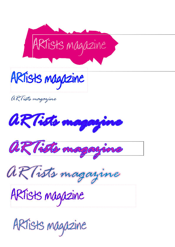
Shown to the right, is my next stage in the development of my title. I choose 3 or 4 different fonts that stood out to me and tried to develop them using stroke and colour features. Although i needed to think about the colour... here, i tried to concentrate more on the font style as i believe that is more important for a title. In the end, i choose the font 'Annie BTN'. I choose this font as i thought it looked rather artist and it was the font that stood out for me throughtout the process.

To finalise my decision on the font, i just needed to choose the font and stroke size. Shown here is my research of this. I looked at the colours i thought would look best as a title. The stroke size was the main focus of my titles as i wanted to affectivly use two colours and make the title bold and demanding. Looking through the colours, i decided i definatly wanted to use black as i knew it would stand out against any other colour. However, i needed to decide whether the black would be the main colour of the writing, or the outlining colour. Eventually, i came to the decision that i wanted it as my main colour and that i wanted a light purple as the outline. Shown below is my final design enlarged.

Thursday, 6 October 2011
Contents research
The next stage of my researching is to find out what i want in my contents page. To do this, i searched for examples. These are shown below.
 This contents page is not overflowing with words which is what makes it so effective. Instead of being full to the brim of things you find inside the magazine, it shows the most important pages which is exactly what the reader wants to read. It does not tell you what is on every page but tells us the most interesting features you can find inside.
 A very effective technique that this contents page has is its simple colour scheme. The only two colours used are red and white with black writing. This makes the text and images very clear and so the reader can easily read them.
The disadvantages of this contents page are that there are no photos or images to show what is inside. By looking at the contents page layout and photos, I cannot see what magazine it comes from. For my magazine, I want to imbed photos within the contents page so that the reader can clearly see what is to be found inside without reading the writing. I also want to make it clear what type of magazine it is.
 This contents page is quite different from the previous one. Instead of being quite plain and quite simple, it is quite an interesting and lively contents page. Similar to the previous contents page I researched, the colours mainly used are black, red and white. I believe these colours are used so that the red stands out as being the most important information and therefore, it stands out to the reader.
 One thing I like about this contents page is the photos that are used. We can clearly see from the photos used that the magazine revolves around music. I think using photos is a very successful technique used on a magazine as it conveys to the reader what is inside. It means that the reader is more intrigued to read inside the magazine.
I like the layout to this magazine; the main feature of the magazine is the big photo which makes it stand out to the reader. This is a technique I would like to use in my magazine
First Photoshoot
Looking at my past research and ideas, I wanted to start trying out and taking photos to see which were most affective. I decided to take photographs of my friend Jessica. However, they did not turn out aswell as I had hoped. They are shown below:


These three photos are samples of the collection of photographs I took. Unfortuantly, I think the photos do not look real enough. The backgrounding and the chair in the photos is a big disadvantage as it means it does not look so much like a classroom. Also, in the second and third photo, flash was used and therefore, you can see Jessica's shadows.
To make an improvement on my next photogrpahs I will ensure to use a setting appropriate for the photograph. This may mean I take the photographs in a classroom at school as it will make the photos more realistic. Also, these photos above were taken in the late afternoon meaning there was not enough natural light. Therefore, in my next selection of photographs, I will make sure to take them during the day to ensure I do not need flash.
Tuesday, 4 October 2011
Front Cover Sketches
After having looked at my photo research and thinking carefully about what i want my cover to look like, i did some sketches to illustrate the ideas i have:

 Shown on the right, is my second front cover design. Here, the model used is looking a the camera which means they are quite central on the page. This means that there is not a lot of space for writing around the sides. I believe this makes the front cover look too busy and posed I do not particularly like this design because of this and therefore, i will not be using it.
My third and final design is shown here on the left. This shows my original plan for the photograph in the background. Like my first design, this one allows my writing to fit well around the photograph and is easy to understand. The page has a good amount of writing on it and is not too busy. Doing this design would mean that i could fit another, miniature photograph on the front which will display to the reader more about what is inside. This is something i want for my magazine which is why this is the design i am going to try and use. My next step would be to try and take some photographs. I want to experiment before taking the real photographs. Look out for my next post to see the first photos!
Wednesday, 28 September 2011
Extra Photo Research
s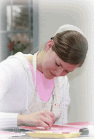

In this photograph, you can see that the colours are quite dim and light coloured. This would mean that there is room for a bold, bright title which is one plan I could use for my magazine. The girl is this phototgraph looks too posed and it is clear that she is working for the camera. In my photo, I want to create more of a natural, real photograph.

This would mean I am taking an idea from both photos I found. On the previous photo, the girl looks rather posed whereas here, it is clear this girl is concentrating more on her work instead of focusing on the camera. In my photograph, I want to do a mixture of both of these techniques. I want my model to look like they are having fun but concentrating at the same time.
Research On School Magazine Front Covers
The first bit of work that I am going to publish is the research I have done on school magazine front covers. By looking at different magazines covers and drawings, it allows me to gather up an idea of what I want to be in mine. Throughout the next posts, I will show my development on the front cover and how i discovered which ideas i want to use for my own.
 1. My first magazine represents Greenfields School. I chose this magazine cover because it stands out by making the school look happy and friendly. I think using this technique is likely to draw students in as it comes across as a place that you could settle in easily which is what every student looks for in a school. The three children show that this school is for young students at a primary age. However, in the bottom left hand corner there is a photo of older students with medals. This illustrates that the school also provides facilities for older students. All the photos on the magazine have a strong impact on the reader as it implies a lot is going on. The colour scheme used is very effective for this type of magazine. All colours are bright which creates the warm, settling view that was mentioned before.
Starting up!
Hello! I'm Jessie Plant and i am doing AS Level Media at Wilmington Grammar School for Girls. I am using the blog to display all my work throughout the year. This will include my step by step development towards my final piece. Here, is where you wil be able to see all my process so enjoy!
Subscribe to:
Posts (Atom)