Showing posts with label Research. Show all posts

Monday, 2 April 2012

Extra Photo Research - Double Page Spread, Moodboard

Shown below is the Mood-board I made which allows me to see lots of different images that all express the image I am searching for in Alice. I like the ideas of the fields and long dresses and skirts. I believe this sort of style would really suit her. I have fields that I can easily access which will correspond with this research. I will take a variety of different styled photos in search for the ones which will look good. These will also be used for the miniature photos in the double page spread. 

Double Page Spread Research

         
This page really stood out to me for numerous reasons. One major one was the photographs. The use of more the one photograph, I think, is extremely effective as it allows more for the reader to view and lets the page tell more of a story. The colour scheme is simple with the colours of black, white and red as the main ones. These all are very complimentary of each other and stand out off the page. The quote is also something that stood out to me and is something, I know is put on most magazine spreads so that the reader can quickly gain an understanding of what is on the page. The big photo taking up one page is a feature I am extremely fond of. Looking at this page, my plan, is to use one big photo graph for the background of my pages and have miniature photos. 


This example is another which has one large photo that takes place mainly on one side. The large photo, I think, is very effective as it allows the characters to stand out. Again, there is the use of the banner on the top left hand corner which I think is effective as it allows the reader to distinguish between different pages of the magazine. There is a lot of writing on the magazine showing  the main focus is the article its self and the photo reflects the personality of the band. 


Here again, shows a large photo as being the main image of the page. The writing, again, is situated on the right. I will ensure my writing it on the right hand side of the page like above as I believe it most compliments my double page research.

Sunday, 25 March 2012

Contents Page - Extra Photo Research 2

Here is my research for my next photo to be put on the contents page. 
For my model, I wanted to find someone who was not blonde so that I could have a variety of looks within my magazine. I decided to use my friend Nakita. 


Shown here are three photos of the same style clothing. What stands out for me with these are the Christmas styled jumpers. Personally, I love this sort of style. In my first photo shoot, I will try out Nakita in the Christmas style jumper. If this style does not suit her then I shall something different. 


Shown here is another style of clothing I could try out on Nakita if the Christmas jumper does not correspond with my magazine. The thing I like about this style is the shorts and plain top. I think this a very effective outfit choice as it ensures that the beauty and features of the model are drawn attention to, not just the clothing. If the first photo shoot is not successful, then I shall use this style within a second photo shoot.


As well as this, I am keen to use a Brick Wall as my background as then, I will not have to edit it as I believe it makes the model stand out. 

Tuesday, 20 March 2012

Contents Page - Extra Photo Research 1

Photo 1 for the Contents
The photos below are extra photos that i have found that will lead me to taking my first photo shoot for my contents page. 


The thing that stands out in the photo above is the ray ban styled sunglasses. This is something I want to put into my photo. Knowing who has some like this, I am going to take photo graphs of my friend Rob. 


This models fashion is what stood out to me. The use of jumper and the collar, I think, expresses the idea of the Indie image I am looking for. I know that my model Rob is very able in pulling off this look therefore, I shall insure that he will dress like this. I will ensure that the jumper is very bright so that it stands out on the page. 

The three above, in my opinion reflect typical 'Indie' style males. Rob is somebody who I directly relate to the Indie style. One thing that I have picked out from the above photo and the photo below is the black skinny jeans. These are something I want Rob to wear as I know they will suit Rob very well. 


Sunday, 11 March 2012

Contents Page Research

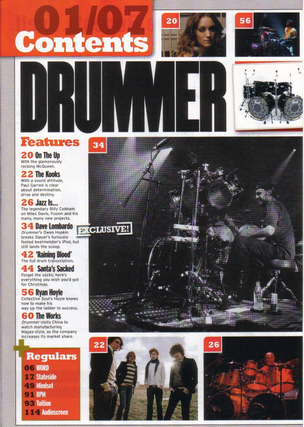
Continuing my magazine, I have decided to do my Contents page next. On the left, is the first one i looked at. I think its effective due to its use of photographs. There is a large, main images and two smaller ones. If I can find models to take photos of, I may create something similar to this page. The information is down the left hand side of the page. However: I do not think there is enough information provided about what is inside the magazine. I want to put more on my contents page then this. 
This is another contents page I found. Again, there is a large use of different models and different photos. Like the previous magazine, there is a picture of the front cover on the page. This is very effective as it means that the reader can directly relate it to the cover. Another thing both of these magazines have is headings for the contents so that a reader can easily find the pages they want. I think this is a very useful feature of a contents. 
There is a lot of use of the colour yellow. Although I do not like this colour, I will use simple colouring in a similar way so that the contents page does not look too confusing. In contrast to the previous magazine, this ones pages are down the right hand side of the page. 


In contrast to the other two, this page contains only one photo which may be more realistic for me.  It does not have a lot of information but concentrates a lot on the photograph. This could be effective as like the front cover does, it captures the attention of the reader and draws them to that particular article or feature. Again, there is a use of the headings on the left hand side making it more accessible for the reader. 


The magazine above is yet another one that has headings As well, as this, on the left there are notes to say which articles/features are on the front page. This is something I am going to try to in cooperate into my magazine. On the left hand side, there is a 'band index' which is something that I have never seen on another magazine reavealing this magazines individuality and uniqueness.


 One thing that stood out about the magazine above to me was the use of the Black and White photograph. As well as having coloured photos, this magazine has used images in a different colour range. This is something i found very interesting and I will maybe adapt it into my work. 


What I need to have on my contents page: 
  • I need to ensure I have a photo of the front cover within so that the reader can directly connect my pages together.
  • I need to take various photos and use more then one model. If this is not possible, then I need to ensure to have a strong photograph for it so that it will not matter if i only have one. 
  • I need to have headings for my pages so that they are easily accessible to readers. 
  • The colour scheme needs to match with my front cover and be not too bold.

Monday, 12 December 2011

Further Photo Research


Looking at my beginning research and thinking very carefully about my model, i have decided to photograph my friend Alice, who I know is very photogenic and is exactly what I am looking for.
Most of these photos will come across in my second photo shoot after I am able to see what Alice is capable of. 

 I would like to take two different types of photographs. One set will be close ups of the model from the waist up. These photographs will be reliant on the eyes of the model and the facial expression. 
The other set of photographs will be full body photographs which will allow me to capture the models complete fashion. The first set of photographs i will do my research on is the close ups. Within this, i will also reveal what props etc i want my model to have.


The photo on the left, displays the type of hair i would like Alice to have. Backcombing will enable me to get Alice's hair quite big and bold. However, I need to ensure that this type of hair suits Alice. I believe having hair like this gives the model a certain attitude and this is the attitude I would like my model to adopt. In my photos I will try out different styles and images on Alice to see which works best in order to discover a look that will capture the 'Indie' style as well as connecting with my research.


Here, is a famous music artist Robyn. I choose this photo because although I do not like the fashion style here, I like the idea of using bubble gum in some of my photographs. This is one idea that i would like to try out during the whole process but I think I will do it in my second set of photographs as I want to start by taking basic photographs and then go into specific ones. My first selection of photo graphs will let me discover what Alice is capable of as a model and allow me to see how comfortable she is in front of the camera. Due to her past experience, I hope to find her confident and comfortable. 


The next photo, again is not exactly the style or look I am wanting to adopt. However, it is similar and from this photo, I want to see how my model looks wearing geek glasses as I see them as alternative look. Like the previous photo, I will try this idea out on my second photo shoot when I start my more specific collection of photographs which will hopefully develop to look rather like the one below.


Looking into geek glasses and facial expressions further, i believe this is a very effective photograph that can relate more to Alice, my model. The facial expression is very intriguing and sensual. I want to promote this look on the front of my music magazine as to me, it comes across as quite an 'indie-rock' attitude. In hope that Alice is able to pull off this look, I will work towards ensuring I can capture her inner rock attitude. 


This final photo, I believe, sums up everything that I am looking for. Through this model, I believe promoted is an sensual yet mysterious feel which from my front cover research, I have discovered is very effective for a cover shot. The hair is very similar to Alice's and therefore, I will try and base my close up photos like this. Although this photograph has no props in it, I believe this is the type of photograph I will settle for as I think it would be an extremely catching and effective front cover image. 


I believe the further photo research on close ups is very beneficial to my magazine cover. However, I would also like to research more into the body of a model as I believe clothing helps to promote certain styles. This type of photo may be more effective for my cover then the close up. If not, then i could use them on my double page spread.
The photo here, promotes the type of fashion i want. I think the shirt and high skirt would suit Alice a lot and therefore, I will definitely try to recreate this image. However, I would like to make my photograph more wintery by putting high socks or tights on my model. As well as this, I realise that Alice has a different skin and hair colour to this model so therefore, I will try and relate it to her by finding colours that will suit her. Also, getting Alice to try out different body poses and clothing will enable me to capture the best possible photo.

Thursday, 10 November 2011

Beginning research

Beginning of the research consisted of finding examples of magazine covers and analyzing them: 


The first set of magazine front covers I found were a collection from the magazine ‘INDIE.’ From my research, I found that it is an independent magazine which combines Music and Fashion. This style of magazine has really captured my interest and I would like to develop some of my ideas from these magazines. I believe a reason why these covers are so effective is because most of the models are shot from the shoulders up which makes their face and eyes the main image. I believe through eyes, a photo can capture feelings and passion. Part of a models job is to sell a photograph using their eyes and therefore,  it is important in a lot of cases to have the model looking at the camera. 

Something i noticed about these magazines is that there is not a lot on the front cover in terms of text and other images. I think this is quite affective as it makes the reader want to look inside to see what can be found. The title is extremely capturing as it illustrates what is in the magazine and addresses the target audience directly.
I know that one of the most important things that I need to work on is coming up with my own, catchy title. As my research develops, I hope that I will come up with an idea for my magazine. I want to make it catchy and relate to my own style. 
Looking at all the covers shown in the INDIE collection, I have decided that I would like a female for my front cover as I believe I can relate to them more and use my own fashion styles to dress them. For one of my ideas, I will photograph my model from the shoulders up like those magazines so to try and capture a story through the models eyes.


For my research, I wanted to look at something different from the INDIE selection of magazines. This is what I found. I believe this photo of John Mayer is very affective as the reader is able to see a typical rock star through this photo. Instead of having photos of the face and top half of the body like the previous research, this photo displays the models whole body and an instrument. I think this is affective as the reader is able to see his body language and he can tell a story through this. I see this model as quite sensual as well as moody and mysterious which I think creates a certain appeal to the audience.
The text on this magazine is quite plain yet clear. There is not a lot on but some of the main words are put in bold so they stand out to the reader. Rolling stones use the technique of having famous models which allows public interest for the magazine. The colour scheme on the page is black and white. Although this an be effective I find it quite dull as there is a lot of writing and therefore I want my cover to display a little more colour.

Looking at the rolling stones cover, I decided on a photograph idea that I am going to try. I am going to try and express a sensual, mysterious feel through my model like shown here. I would like a white background to ensure that the model is clearly the main focus of the cover and it will make my text on the magazine clearer and easier to read. In contrast to this magazine, my model will be female. I will also be promoting a different type of music. Instead of Rock, i will be advertising Indie music and therefore, my model needs to portray the correct image.


The next magazine cover i found is shown here on the left. The thing that drew my attention towards this was the model on the front and her style. To me, she is promoting indie styled clothing which i think is important for the indie magazine. I want to make sure I try out lots of different styles of clothes in order to eventually capture a perfect image of what I want. The colours on the magazine are quite girly and bold. This makes the magazine one that would stand out on the shelf to its readers. Unlike the previous magazine, this conveys rather happy, lively image of a new coming artist. Instead of promoting moody and rather dramatic music it comes across as a feel good magazine that young teenage girls  would likely be the target audience. 
BLURT magazine caught my attention quite a lot as i felt i would personally read it. I love the image that the model is projecting and hope to reveal a similar image within my magazine. The colour scheme for this magazine is different to my other research as it focuses on girly and unique colours like pink and blue. Although i would like to experiment with these colours, i need to ensure my magazine maintains a look of professionalism. I will experiment with these ideas in hope to create a professional yet capturing magazine cover.


NME is a well known magazine that revolves around whats new in the music world and what is up and coming. This magazine I picked from their selection is shown on the right. Like the previous magazine, this cover looks into an upcoming album or artist. The colour scheme on this page is red and white writing with a background photo. I believe this album looks quite busy which is like a lot of music magazines. The boldness of the writing hints to us that it is a music magazine. The colours are harsh and stand out to the reader to draw attention. This is effective for any magazine as it is important that the writing stands out to the reader and interests them. I do not like the yellow and brown colours on this magazine as I think they are rather dull and repulsive colours. I do not think they would successfully draw in readers and did not find the magazine in general as capturing as the previous. 
As I found the imaging and colour of the actual photograph used rather dull and unappealing, I want to ensure I use nice colours in my magazine in order to make readers attracted to it just by first look. However, from this magazine I may take the idea of a lot of writing depending on my photograph. Although I do not want too much writing, I want to be able to display what is inside my magazine so that it will appeal to the reader.


The last magazine of my beginning research is shown here. This is the magazine cover that most stood out to me as I believe it promotes the 'Indie' image exactly. The model on the front Florence is a singer I directly relate to Indie music and her style of music and fashion is something that I am extremely interested in. Although the colour scheme is not particularly interesting, I think the model is what stands out most from this cover proving that it is essential that I find the right model for my look. The hair of the model I believe is very effective as it makes her facial features stand out. Again, I notice the bold yet clear writing. This gives me the idea that I need to ensure my title is bold and clear in order to adopt the style of a music magazine in general.
This magazine, selected as my favorite, displays the exact image I want to capture. 


In my 'extra photo research', i need to do the following: 

  • Ensure each photo displays a female model.
  • Find photos that use props in the photo 
  • Find photos with the models hair emphasized like the photo above
  • Find different styles of photos such as from the shoulders up and long shots
  • Find photos that illustrate the 'Indie' style