Continuing my magazine, I have decided to do my Contents page next. On the left, is the first one i looked at. I think its effective due to its use of photographs. There is a large, main images and two smaller ones. If I can find models to take photos of, I may create something similar to this page. The information is down the left hand side of the page. However: I do not think there is enough information provided about what is inside the magazine. I want to put more on my contents page then this.
This is another contents page I found. Again, there is a large use of different models and different photos. Like the previous magazine, there is a picture of the front cover on the page. This is very effective as it means that the reader can directly relate it to the cover. Another thing both of these magazines have is headings for the contents so that a reader can easily find the pages they want. I think this is a very useful feature of a contents.
There is a lot of use of the colour yellow. Although I do not like this colour, I will use simple colouring in a similar way so that the contents page does not look too confusing. In contrast to the previous magazine, this ones pages are down the right hand side of the page.
In contrast to the other two, this page contains only one photo which may be more realistic for me. It does not have a lot of information but concentrates a lot on the photograph. This could be effective as like the front cover does, it captures the attention of the reader and draws them to that particular article or feature. Again, there is a use of the headings on the left hand side making it more accessible for the reader.
The magazine above is yet another one that has headings As well, as this, on the left there are notes to say which articles/features are on the front page. This is something I am going to try to in cooperate into my magazine. On the left hand side, there is a 'band index' which is something that I have never seen on another magazine reavealing this magazines individuality and uniqueness.
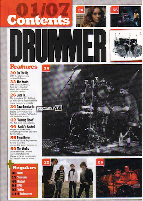
One thing that stood out about the magazine above to me was the use of the Black and White photograph. As well as having coloured photos, this magazine has used images in a different colour range. This is something i found very interesting and I will maybe adapt it into my work.
What I need to have on my contents page:
- I need to ensure I have a photo of the front cover within so that the reader can directly connect my pages together.
- I need to take various photos and use more then one model. If this is not possible, then I need to ensure to have a strong photograph for it so that it will not matter if i only have one.
- I need to have headings for my pages so that they are easily accessible to readers.
- The colour scheme needs to match with my front cover and be not too bold.


No comments:
Post a Comment