Using Photoshop
In my opinion, the photo of Nakita was nearly right. The only effect I used was to increase the contrast of the photo. This enables the model to stand out.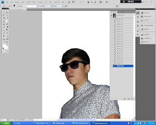
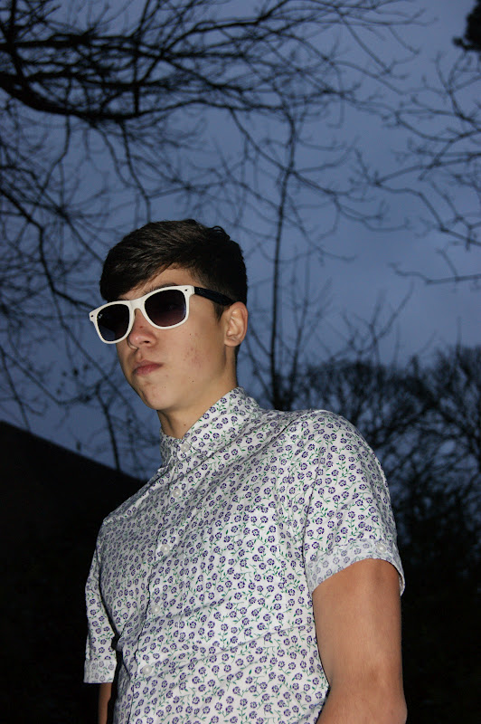
Since the photos of Rob were very dark, I decided to use the Brush tool in order to make the background WHITE. I also used the Magic Wand tool to select the glasses in order to make them BLACK. This ensured that they did not blend into the background. I used the Export tool to make the images JPEG's.
Into INDESIGN
Next, I began to plan the look of my contents page.
Looking at my previous research, I saw that most of the contents pages I looked at had headings such as 'WHATS NEW' and 'LIVE'. Therefore, I was keen to adapt this into my work by using the headings of 'WEEKLY/THIS WEEK', 'WHATS NEW', 'FEATURES', 'LIVE' AND 'PLUS'. Under these I was then able to put my pages. To ensure that the page numbers stand out, I made the colour of the numbers RED.
For the title of the contents page, I wanted to make a box to insert the text into. At first, I was keen for it to be RED so that it would stand out on the page. However, on further thought and looking at my research, I decided to make the box BLACK and the writing WHITE which would ensure that it would stand out on the page without drawing attention away from the writing.
To ensure that the headings stood out. I decided to make the writing of them WHITE with the background of BLACK which would be the same as the title so therefore, go well on the page. As well as this, at this stage, I prepared the typing for my photos. I put the names of 'Rob Rutnam' and 'Nakisha Pattni' in the font BROADWAY. This is so it would stand out.
Using the Place tool, I inserted the photo of Nakita and also Placed a mini version of the front cover of my magazine. I had to place the writing in different places in order to make it look clear next to the photo.
Using the Place tool once again, I inserted the image of Rob. Then, on the boxes of the headings, I used the effect of Drop Shadow in order to create a more 3D look.
To try and make the pages and their sections look more professional. I put the main point of band of each page and put in in BOLD in order to make the most important factors stand out to the reader.
Wanting to use a Different Font, I decided to make the font of the page headings CALIBRI as it looked professional and clear.
Shown Below is an idea I took from one of the magazines on my 'Contents Research'
Using the idea of the RED meant I knew that this box would stand out. I think having this within the contents page promotes a connection between the magazine and the reader. It is a feature I have seen in a lot of magazines. Including Fashion ones such as 'LOOK' magazine. I liked the idea of it as it made my Contents Page more personal.
I wanted to change the background so it was not plain WHITE. So therefore, I took the background colour of my Front Cover and made the contents page the same with the intention of adding a Gradient later on. This colours number's are shown above.
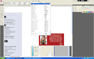
I made the font on the 'Editor' VIVALDI so that it looked like hand writing. This is a feature which I adapted from the example I took from the research. I think its a special technique that makes the magazine more professional.
Thinking about my design of the page, I decided I would rather create a smaller size title and put my Editor feature next to it. This made it look fuller.
Here, I decided again to change my positioning on the page. I also decided that I wanted to make the boxes of my titles bigger like shown her. I used the Group tool again. I think the bigger boxes fills the page more.
Shown here is all of the boxes increased in size.
Next, I wanted to change the Font of the writing around the photo of Rob. I changed it to BELL GOTHIC STD so that it stood out from other fonts on the page and I wanted to ensure that I used a variety of fonts through my pages.
I again used the effect of the Drop Shadow for each box to ensure that page looks more exciting and full.
To make the background look better, I used the Gradient Swatch tool. This meant that the page looked less dull.
Lastly, I decided to put an effect of bevel and emboss on my editor box in order to give it a 3D effect.


.jpg)


.jpg)