Saturday, 14 April 2012

Evaulation Question 2 - How does your media product represent particular social groups?

For my magazine, I wanted to aim towards a particular social group so that I could focus on making my work relate to a certain group of people. It meant that I was able to be extremely specific on what I researched. I chose to focus my work towards an INDIE social group. To show what I think represents the INDIE social group, I created a short video which is shown below. 


Another way I was able to represent the Indie social group was through the use of clothing. Shown below is another short video to show how I took images from my 'Extra Photo Research' and used these images to generate my own photos. I made sure to use Models that related to my research and would look good in the clothing I researched. 
As you can see, a lot of my ideas for clothing came from existing products. I think this is essential in order to make my magazine look professional and make my models stand out. I used the ideas for clothing more on the contents page then any other. This is because I needed to continue adapting the style of Indie on models that are not Alice. As Alice, in my opinion, already promotes the 'Indie' image through her own clothes, she was very easy to dress. However, Nakita was more difficult which is why I used lots of extra photo research and ensured I related to it.


Thursday, 12 April 2012

Evaluation Question 1 - In what ways does your product use, develop or challenge forms and conventions of real media products?

Within my project, I wanted to ensure that I developed my work around real media products in order to maintain a look of professionalism. Researching real magazines allowed me to discover popular and professional ideas for colour schemes, font and page layouts. Using conventions of real media products enabled me to adapt my work.
My research was split into two different sections: General research of magazines and extra photo research.

Using the general research of pages allowed me to create three more professional looking pages. As shown below, finding real magazines allowed me to adapt the different parts into my work such as: 
  • Bold titles and headings
  • Features
  • Bar codes
  • Box headings
  • Photo position 
FRONT COVER: I gained a lot of ideas from SPIN Magazine for my front cover. Including the idea of a black box behind white writing, making 'Alice Hall' stand out. The 'featuring' aspect of the cover is also something I think is very professional and stands out to the reader. It also makes my contents page easier to relate as I am able to mention each of these artists.

CONTENTS PAGE: I struggled with this the most. In terms of ideas, I was able to adapt many by looking at the KERRANG Magazine. It gave me a lot of ideas such as the headings of 'This Week' etc and also a note from the editor. I think this note makes my contents page seem more personal and makes the magazine seem regular.

DPS: I found my double page spread a lot easier to create then my Contents and Front. I believe this is because it was revolving around one focus. I looked, again, at the KERRANG magazine and saw many features that I could use. This included the Red 'Exclusive' sign on the top left hand side of the page. This was an effective feature as I believe it makes the article stand out to the reader as important. As well as this, I developed the idea of using one big photo as the background to the page and then used three miniature photos. This gives the reader more to look at and adds a sense of professionalism. 
Below is a online scrapbook I created in order to present question 1 more clearly:
| Learn About Mixbook Photo Books | Create your own Photo Book
The use of the 'Extra Photo Research' enabled me to fully focus on the photos I needed to take. I was able to use the photo research to:
  • Find outfits that will compliment my models
  • Find backgrounds suitable for a magazine
  • Make up and hair styling

Monday, 2 April 2012

Final Double Page Spread


Stages in Production - Double Page Spread

In Photoshop
On this photo, I used Contrast to make the photo stand out more and allow Alice's features to be clearer. As well as this, I used the Clone Stamp to fade out the grass a little so that the writing would stand out once it had been put on. 

To this photo, I needed to sort out the background above Alice's head. Therefore, I used the Clone Stamp to add trees behind. This was so that her hair would not be washed out by the brightness of the sky. 


Into InDesign
In order to create a double page spread, there needs to be different settings to the Front cover and Contents page. Therefore I changed the settings to be an A3 paged and in Landscape .


After using the Place tool to put the photo-shopped photo of Alice as the background, I decided to create the  'Exclusive Banner' that is shown in my Research and Sketching. The sizes of the rectangle are shown above.

 To ensure that the sign of 'Exclusive' stood out, I wanted to make sure the font was a bold font so therefore, I choose to use STENCIL ST.  

Knowing that the colour of the backing for 'Exclusive' should be RED, I set the dials as shown in the shot above using Colour Picker.

Using the Group tool, I was then able to put the 'Exclusive' on top of the RED rectangle. This meant that it would stay in place and I would be able to put effects on it if I wanted to later on. 


Next, I wanted to Insert the photos onto my page. I did this using the Place tool. At first, I tried them out placing them on the bottom left hand side of the page.

The next stage was to insert the text. I started to use the Guitar on the page to see if it looked effective. I wrote out the article in full before inserting it onto the page. I decided to use an Interview for my writing. Here, is the use of Three columns. I kept the font BLACK to ensure professionalism and made sure the writing was clear. 

A feature I have noticed on many different articles is the use of the first letter of the article being larger font then everything else. This is what is shown here. 

I put the font as ERAS DEMI IT, as it is a font that stands out and became clear with my background. 

To ensure the questions of the article stand out more, I made the the font of ERAS BOLD ITC. This was so it stood out from the other writing but still stayed as a similar font.

Shown above is the Quote I want to enlarge and use on my page. I will need to change the design in order to find where the quote looks the best. 


                                              At first, this is how my page was set out. 


I changed the positioning of the photographs to correspond with my design of magazine. I Placed the photos on the left hand side of the page like shown. 


I moved the quote above the writing to look professional and it corresponds with my NME research. 

Double Page Spread Specific Sketches


Using this photo, I have created two different sketches which I will try out: 

1.

2.

As you can see, they are both very similar. However, the design of them is different. On my page I shall try the two different designs to see which looks better. 

Double Page Spread Decision


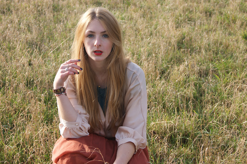
Shown here are the four photos I have chosen to be in my double page spread. Above, is the photo I will use for my main image on the background of the page. I believe that Alice's emotion comes through clearly through her face. I also think her clothing corresponds well with the setting. The photo also allows space for writing and more photos. 

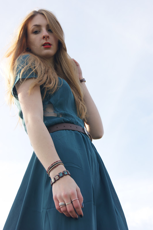
On the left, is one of my favourite photos from the shoot. I think it is an effective image as the sky is a main feature of the photo which goes well with her blue clothing. It is quite a sunny day which reflects her album that I am going to write about within my article. The lipstick stands out on her face as she is quite pale yet, it makes her facial features come across as bold. 


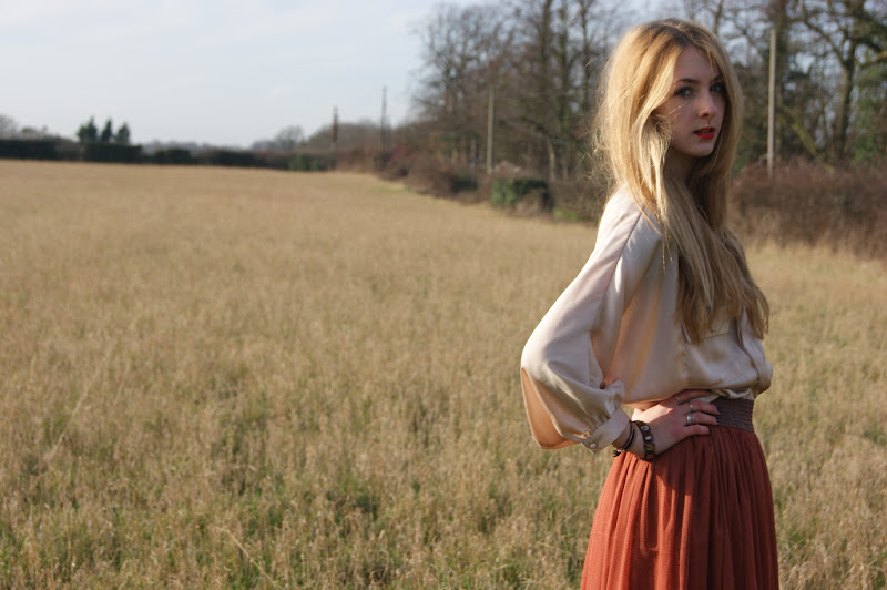
The photo on the right here, I believe tells a sort of story. I think it is more interesting then the other photos as it is not dull and it shows Alice doing something other then just looking at the camera. Her clothing, I think, goes extremely well with the background setting as there are a lot of brown colours. 

This is my last photo. I think  it is an effective photo as it is shot from a different angle to the others. This photo has more concentration on Alice's feet which makes her boots stand out. This is an effective technique as I believe her shoes promote an Indie-Rock style. The background will need to be changed as her hair seems to be washed out by the background. Other then that, I think this is a rather effective photo that I look forward to using on my Page.                                                                        

Double Page Spread - Photoshoot

Shown here are my photographs for the Double Page Spread