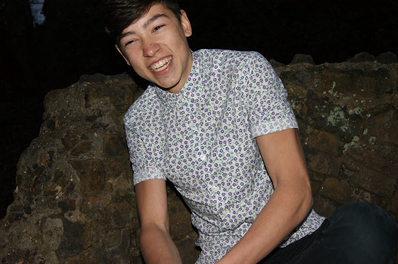
These are the selection of photographs I have taken of Rob.
Tuesday, 20 March 2012
Contents Page - Extra Photo Research 1
Photo 1 for the Contents
The photos below are extra photos that i have found that will lead me to taking my first photo shoot for my contents page.
The thing that stands out in the photo above is the ray ban styled sunglasses. This is something I want to put into my photo. Knowing who has some like this, I am going to take photo graphs of my friend Rob.
This models fashion is what stood out to me. The use of jumper and the collar, I think, expresses the idea of the Indie image I am looking for. I know that my model Rob is very able in pulling off this look therefore, I shall insure that he will dress like this. I will ensure that the jumper is very bright so that it stands out on the page.
The three above, in my opinion reflect typical 'Indie' style males. Rob is somebody who I directly relate to the Indie style. One thing that I have picked out from the above photo and the photo below is the black skinny jeans. These are something I want Rob to wear as I know they will suit Rob very well.
Sunday, 11 March 2012
Contents Page Research
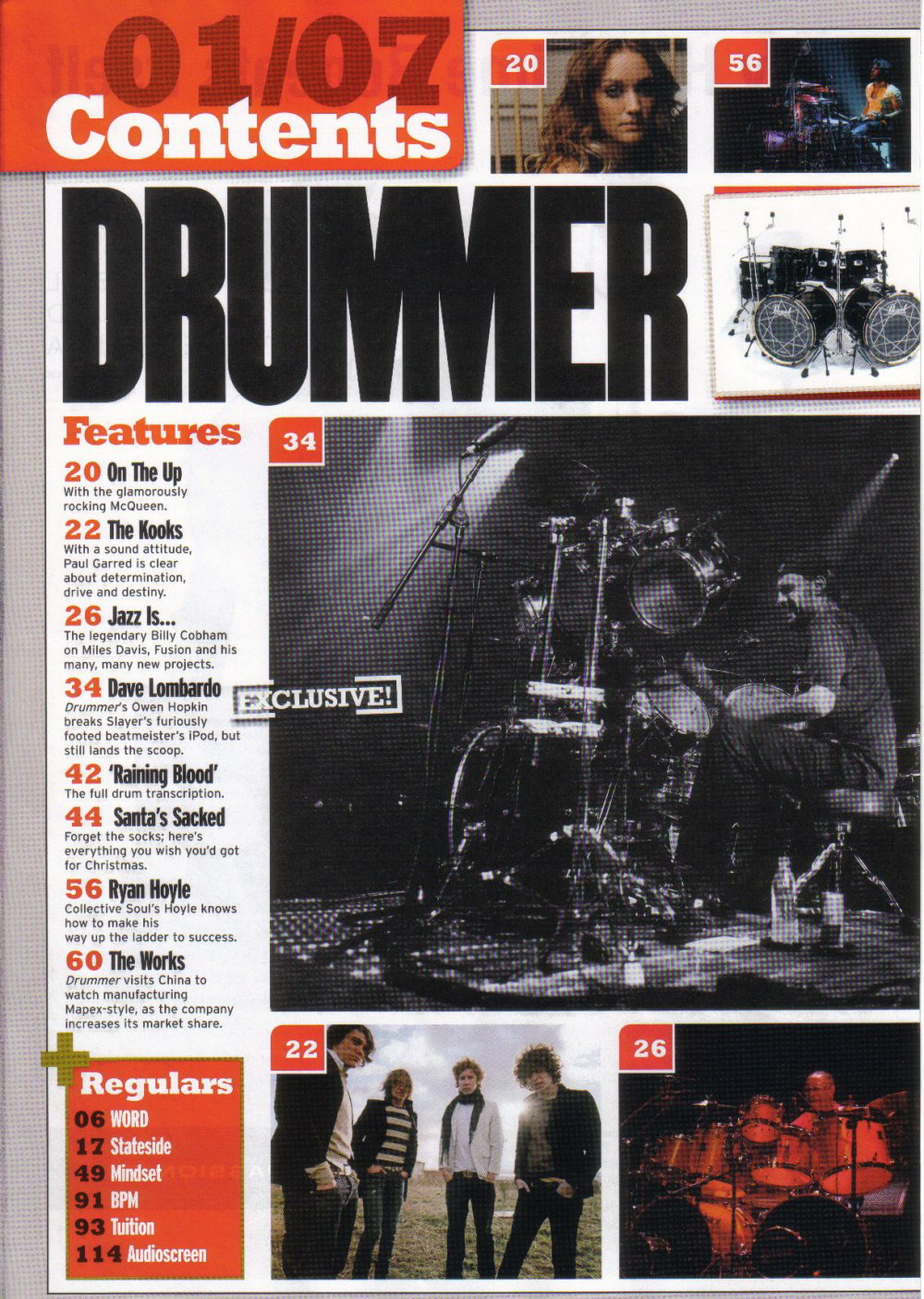
Continuing my magazine, I have decided to do my Contents page next. On the left, is the first one i looked at. I think its effective due to its use of photographs. There is a large, main images and two smaller ones. If I can find models to take photos of, I may create something similar to this page. The information is down the left hand side of the page. However: I do not think there is enough information provided about what is inside the magazine. I want to put more on my contents page then this.
This is another contents page I found. Again, there is a large use of different models and different photos. Like the previous magazine, there is a picture of the front cover on the page. This is very effective as it means that the reader can directly relate it to the cover. Another thing both of these magazines have is headings for the contents so that a reader can easily find the pages they want. I think this is a very useful feature of a contents.
There is a lot of use of the colour yellow. Although I do not like this colour, I will use simple colouring in a similar way so that the contents page does not look too confusing. In contrast to the previous magazine, this ones pages are down the right hand side of the page.
In contrast to the other two, this page contains only one photo which may be more realistic for me. It does not have a lot of information but concentrates a lot on the photograph. This could be effective as like the front cover does, it captures the attention of the reader and draws them to that particular article or feature. Again, there is a use of the headings on the left hand side making it more accessible for the reader.
The magazine above is yet another one that has headings As well, as this, on the left there are notes to say which articles/features are on the front page. This is something I am going to try to in cooperate into my magazine. On the left hand side, there is a 'band index' which is something that I have never seen on another magazine reavealing this magazines individuality and uniqueness.
In contrast to the other two, this page contains only one photo which may be more realistic for me. It does not have a lot of information but concentrates a lot on the photograph. This could be effective as like the front cover does, it captures the attention of the reader and draws them to that particular article or feature. Again, there is a use of the headings on the left hand side making it more accessible for the reader.
The magazine above is yet another one that has headings As well, as this, on the left there are notes to say which articles/features are on the front page. This is something I am going to try to in cooperate into my magazine. On the left hand side, there is a 'band index' which is something that I have never seen on another magazine reavealing this magazines individuality and uniqueness.
One thing that stood out about the magazine above to me was the use of the Black and White photograph. As well as having coloured photos, this magazine has used images in a different colour range. This is something i found very interesting and I will maybe adapt it into my work.
What I need to have on my contents page:
- I need to ensure I have a photo of the front cover within so that the reader can directly connect my pages together.
- I need to take various photos and use more then one model. If this is not possible, then I need to ensure to have a strong photograph for it so that it will not matter if i only have one.
- I need to have headings for my pages so that they are easily accessible to readers.
- The colour scheme needs to match with my front cover and be not too bold.
Stages in Production - Front Cover
To control the background, i used the blur tool. It was extremely hard for me to do this successfully in order to make the whole background white because after backcombing Alice's hair, it meant that is was very hard for me to make the edges around Alice's head flawless.
Next, I needed to create a new layer of Alice's head therefore, I cropped it and used the clipping path tool to get her head by itself. This allowed me to place her head in front of the title creating a 3D effect.
Still using Photoshop, I inserted the photo behind the text and then inserted the photo of head on top to create my 3D effect.
This was the result of the 3D effect. The use of the clipping path allowed me to make it look more realistic. I exported this as a photo so I could place it into InDesign.
Taking the idea from 'Spin' magazine, I made a design for my front cover which shows which artists are featuring inside the magazine this week. I liked this idea as using artists names allows me to emphasise that 'Sidetrack' is a music magazine. I used the font Britannia bold throughout so that my magazine would remain consistent.
Using InDesign:
I wanted to make sure Alice's name stood out on the cover. Therefore, I created a rectangle and coloured it BLACK as it corresponded with my colour scheme and would allow it to stand out. I placed the white writing on top and used the Group tool to ensure that it would remain in the position I wanted.
Next, I wanted to create a quote for Alice which would be seen later on in the magazine. To make this writing stand out, I made it the colour RED. As well as this, I used the effects Satin and put an outer glow on the writing. This ensured that it did not look dull and made sure it stood out on the page.
When I had positioned the name and quote for Alice, I decided to insert the bar code in the bottom left corner and according to my previous research, bar codes are always put on the corner of a page.
I wanted to create a circular advertisement as, being a regular reader of magazines, it is a regular feature used on many magazines. To make the feature stand out more i used the effect of Bevel and Emboss which would give it a more 3D effect.
Knowing that the tickets for the festival of Reading and Leads were soon to be out, I decided to add a competition to win tickets on my magazine. I mad the circle RED to ensure it stood out and the writing WHITE so it is clear. I wanted the words to be clear within the circle therefore used Gill Sans Ultra Bold.
Lastly, I put the issue and the date onto the magazine making it more realistic. Ensuring I used a different font, I used Hobo STD and using a BLACK font, it meant that the date and issue were clear but would not draw any attention away from the important features of the cover.
Front Cover Sketch
This is my final front cover sketch. Although, it is a basic sketch, it shows the outline that will lead me to create my final cover.
Subscribe to:
Posts (Atom)